

The Full Process
All businesses need to build trust.
IFAs more than most.
A well made brand helps you earn that trust
But, your "brand" is impacted in every single interaction...
So, how do we control something that broad?
Case Study
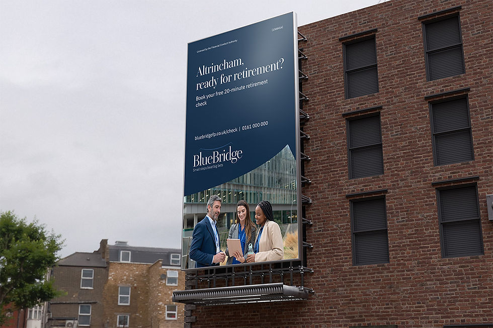
BlueBridge IFA
an Altrincham IFA guiding people across long journeys
Part 1: Preparation
All brand work should start with studying how the business already works:
-
services,
-
culture,
-
leadership values,
-
client experience.
The brand should fit around the business, not the other way round.

What we learnt about BlueBridge
Services: retirement, pensions, ISAs/investments, protection, cashflow.
Culture: calm, methodical, plain English.
Leadership: prudent, transparent, long-term, educative, compliant.
Client experience: 24-hour replies; quarterly touchpoints; annual one-pager.
Constraints: FCA wording, archiving, contrast, small sizes, print-friendly.
With this, we can start building the foundations...

Part 2: The Foundation
This is how we get the consistency...
We decide on
One
Big
Idea
Because of BlueBridge's methodical values and long-term attitudes, we chose...
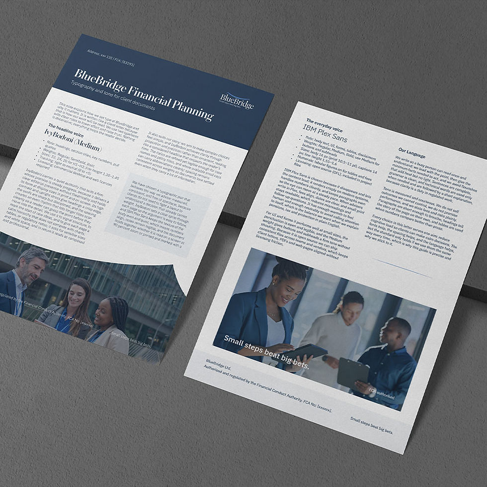
"Small steps beat big bets"
This idea will guide every brand decision
Humans connect through values.
Building a brand off of a single value statement builds trust because it is clear and consistent.
When we ask any brand or design question from now on, we refer to our statement.
Part 3: The First Design Layer
The first things to build are:
-
Name
-
Logo
-
Colours
-
Fonts
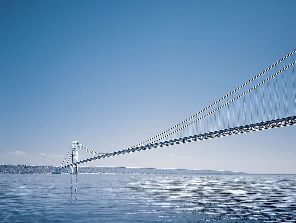
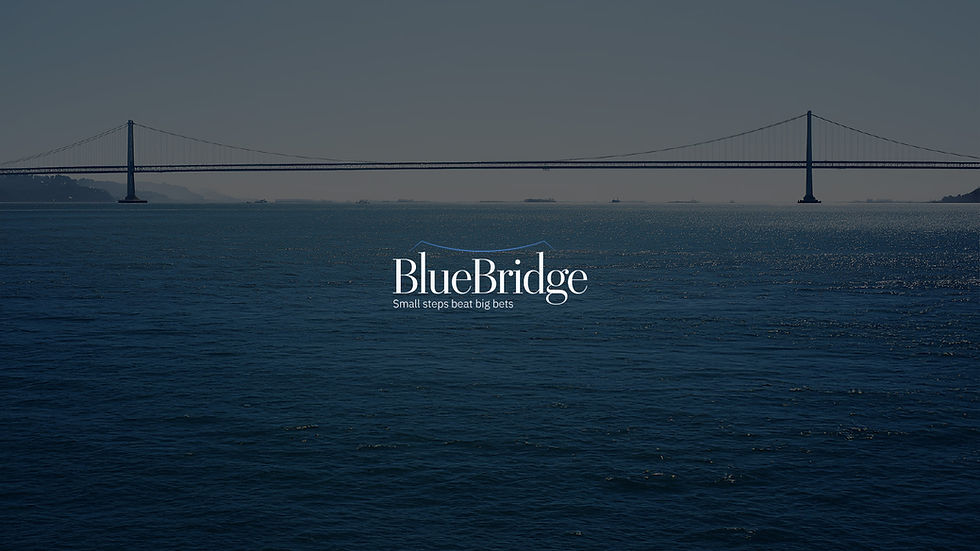
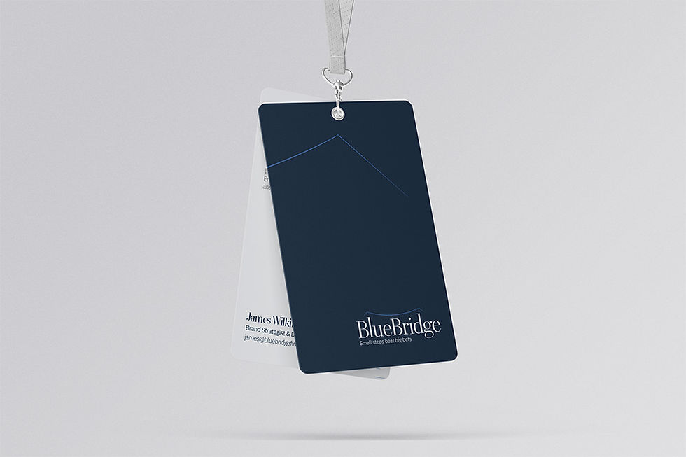
Name: BlueBridge
With our core principle being "Small steps beat big bets", we felt that the bridge imagery would represent journeys and steady progress. The colour blue is synonymous with finance and trust. With this, we agreed that BlueBridge would best represent our leading value.
Logo
A proper logo must:
-
be legible at small sizes
-
be readable at a distance
-
have balanced weight and proportion
-
be clear in black and white
-
work reversed to white
-
have correct optical spacing and kerning
-
have consistent stroke contrast and curves
-
scale from favicon to signage
-
survive low quality print and screens
-
hold over photos and textures
-
be built on a simple, repeatable grid
-
support adaptable lockups with or without a strapline
-
meet accessible colour contrast for wordmarks
-
be mapped to RGB, CMYK and spot
-
be documented with minimum size and clear space
and a whole lot more.
The experience I bring means all of this is already considered when we are working on logos together.
in addition to all of this...
Every logo I create has a "puzzle"
I was taught this by my current design mentor.

... why?
Because the satisfaction of solving the puzzle is so memorable
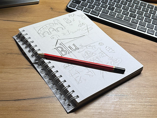
With all of this in mind, we sketched up some ideas
... and landed on a classic serif wordmark
where the "l" and "d" rise slightly to form pylons carrying a thin suspension bridge line
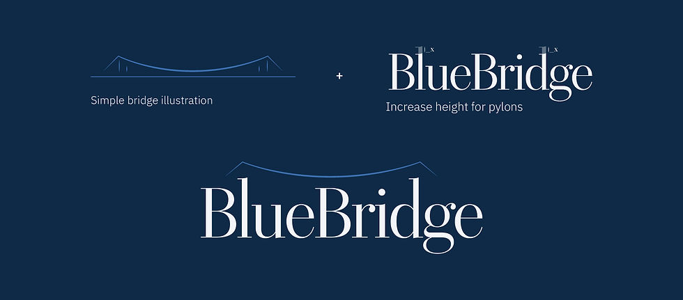
Designed to work at XL sizes...


and extra small sizes
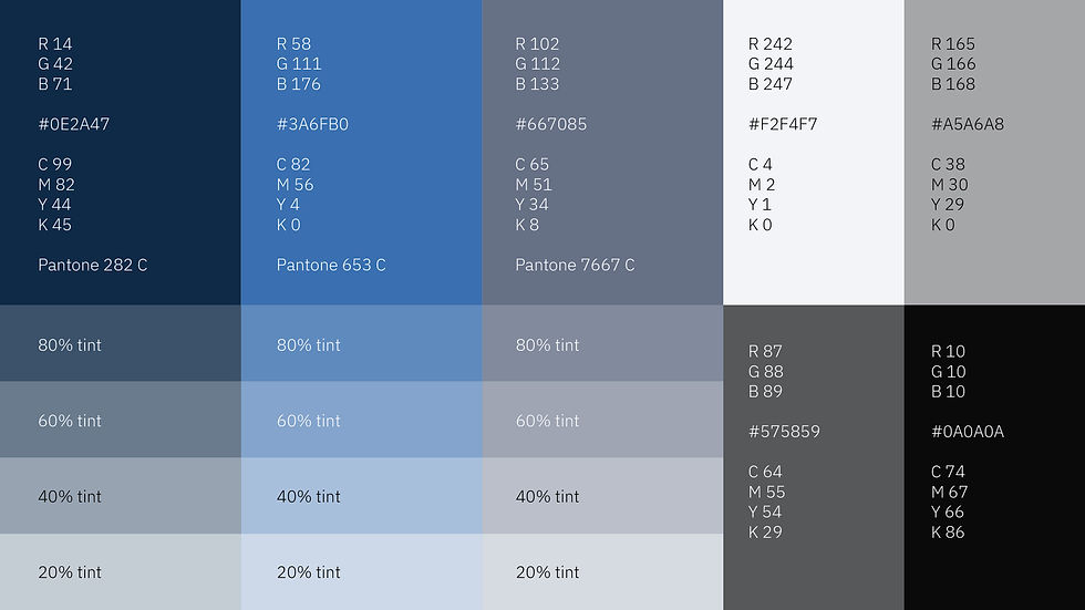
Colour
We are not looking to "stand out"
We are looking to communicate "small steps" - steadiness, certainty.
A navy-led palette communicates this elegantly
Fonts
We needed something which fit "small steps"
calm, precise, traditional
This meant sticking to just 2 fonts
One headline font which carries poise and structure
and one body font which reads clean all day
This led us to IvyBodoni for the headings
and IBM Plex sans for everything else
Part 4: The final touches
This foundation is useful for a brand...
But, to be useful for a business, we need some practical assets
Cue buttons, containers, dividers, and patterns. All of which built to compound the message: "Small steps beat big bets"
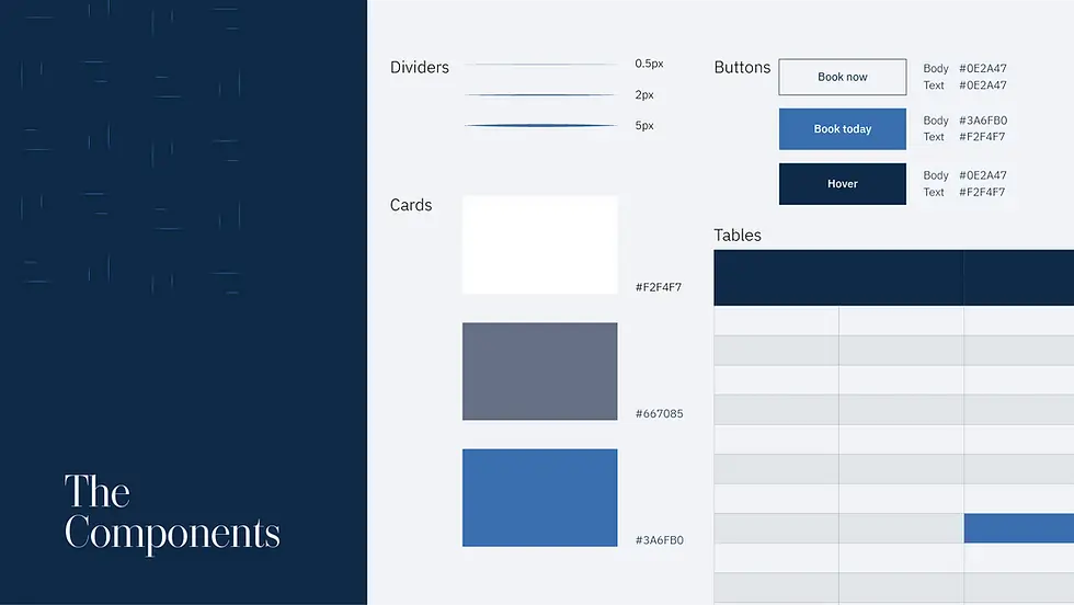
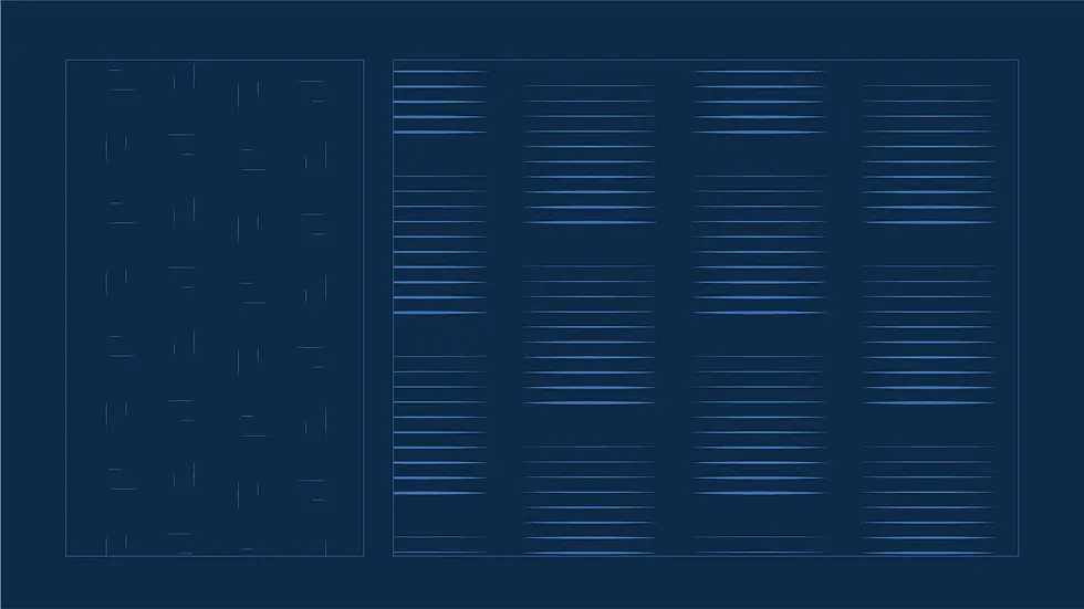
This is where the brand becomes a full system
Part 5: Ongoing Build
With a system, we can now achieve our outcome: trust.
But...
All businesses have ongoing digital design requirements
-
Social media profile and graphics
-
Crisis & Tax event literature
-
Ad creatives
-
Fee explainer documents
-
and so on...